Did you know that the global retail ecommerce sales are slated to grow to 6.54 trillion US dollars in the next two years?
It’s evident that ecommerce businesses are set to get a huge push. If you run an ecommerce business, it’s time to pull up your socks.
Sure, you may see a surge in traffic on your website with everyone wanting to shop online. But ultimately, it’s your job to convert those visitors into customers.
That’s why it’s important to design your website with the customer experience in mind. In this post, let’s take a look at some of the things you need to keep in mind to design an effective ecommerce site.
9 Tips to Design a Customer-Centric Ecommerce Website
While designing your ecommerce website, you really need to step into the shoes of your customer. Think about the questions and concerns they might have and address them all with your website design.
A well-designed website enables customers to find what they want as quickly as possible. In addition to this, they should be able to find all the details and be able to place their order without any hassle.
That’s a tall order, isn’t it?
Let’s take a look at some ways in which you can create a more customer-friendly ecommerce website:
1. Create a Responsive Website
Mobile phones, tablets, or desktops — your website visitors may be using any of these devices for online shopping. Regardless of which device they’re on, your website should provide a uniform experience.
That’s where responsive website design comes into the picture.
Responsive websites automatically adjust their website layout and content to fit different screen sizes. In a nutshell, they are designed to be flexible.
If your website is not responsive, users on certain devices may not be able to read your content without scrolling a lot.
Or your images might only be partially visible.
Check out the screenshot below to understand how users see unresponsive websites.
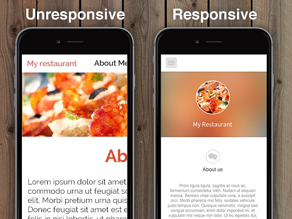
Image via Medium
Overall, unresponsive websites are not convenient or user friendly.
While designing your ecommerce site, make it a point to choose a responsive template to improve the overall shopping experience.
2. Reduce Your Page Loading Speed
Ever experience frustration because a website takes too long to load? Come on, we’ve all gone through it at least once. Not only is it annoying, but also a massive waste of time.
In fact, a long page loading speed can drive away impatient shoppers.
According to a study, the pages that took about 1.5 seconds to load, had a bounce rate of 38.24%. On the other hand, the bounce rate was 44.28% for pages that took longer than 3 seconds to load.
The key takeaway is pretty clear — Don’t make your site visitors wait.
What can you do to reduce your page loading speed?
First, find out how your site currently fares with respect to page loading speed. Go to Google PageSpeed Insights and enter your website URL. This way, you’ll be able to get your current page loading speed.
Using this tool, you can check the page loading speed for both mobile as well as desktop devices. Furthermore, they also provide suggestions on how to improve your site speed.
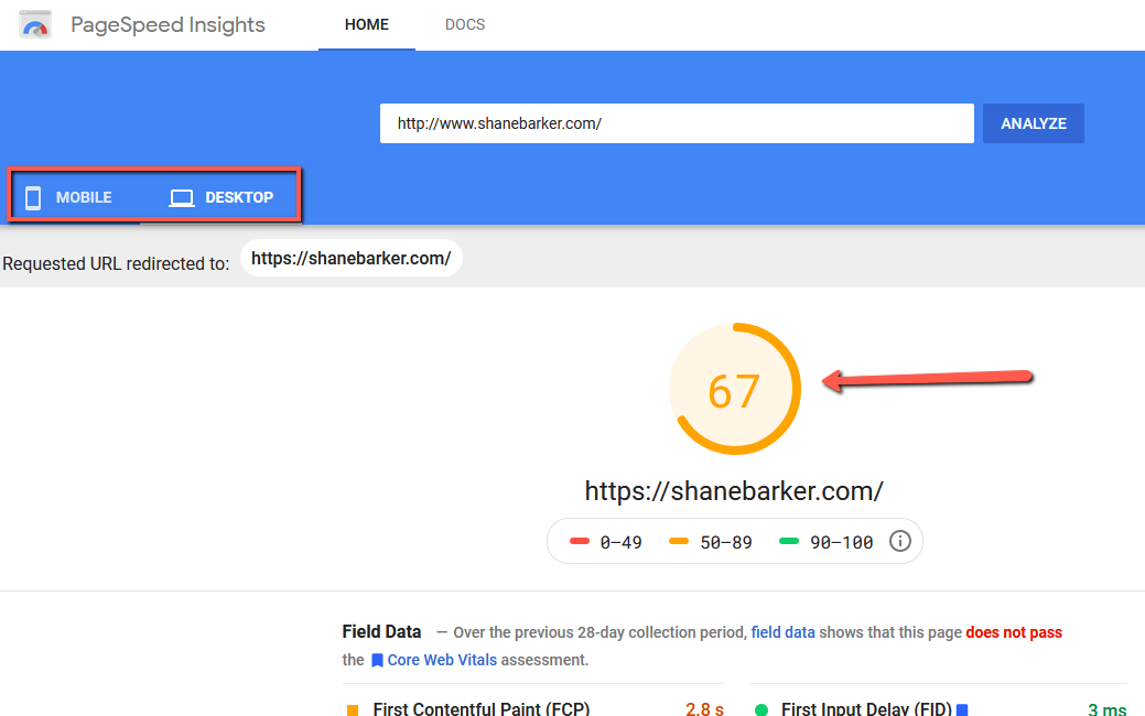
Image via Google
3. Use High-Quality Visuals
While shopping in-person, prospects can touch, smell, and feel a product before they buy it. They don’t have that luxury online. Instead, they depend on website photos and videos to assess the product.
Clear, high-quality, and visually pleasing graphics can go a long way in influencing a customer’s purchase decision.
To give your customers a better idea of the product you are selling, make sure you upload multiple images. Shoot them in such a way that any special features can be easily highlighted.
Online clothing and shoe retailer, Zappos, does a great job of displaying their products on their website. As you can see in the screenshot, they have a panel full of product images from different angles. Additionally, they also have a video for each product for more clarity.
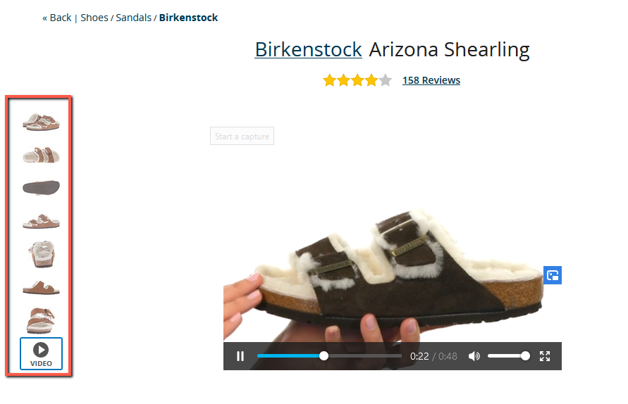
Image via Zappos
4. Display Customer Reviews Prominently
Another major factor that can influence purchase decisions is online reviews. They can make or break a prospective customer’s trust.
People often look for online reviews before buying a product because they want to make sure that they are putting their money in the right place. Quality, customer service, authenticity — they want to crosscheck it all from genuine customers.
Keep this customer requirement in mind while designing your website. Make it easy for people to find reviews of your products or services. Make sure you display the review section prominently.
You can get inspiration from Best Buy’s website design. Under the name of the product, they have a heading that shows the total number of reviews on the site for a particular product. When users click on it, they can read all the detailed reviews.

Image via Best Buy
5. Simplify the Checkout Process
After a prospect decides to make a purchase, how much effort do they need to put in before they can complete the checkout process?
Do they have to go through multiple pages and provide a long list of details? If the answer is yes, it’s a lengthy process. Some prospects might just leave the process mid-way because they are exhausted or distracted.
To avoid this, make the checkout process as simple and convenient as possible. Ask prospects to enter only the information that you absolutely need.
Name, address, and payment details — these details should be more than enough to complete the purchase.
ShopBase knows that a convenient checkout process is important to improve the overall customer experience and conversion rate. It’s why every single store on ShopBase can take advantage of the built-in one-page checkout feature for free. Within a few clicks, you can select the product, finish checkout, and get your order done.
It’s super quick and clearly laid out on their website.
Image via shopbase.com
6. Optimize Your Website Navigation Structure
As an ecommerce website owner or marketer, your goal should be to minimize the total number of clicks for users. They should be able to find whatever they are looking for quickly and easily.
At the same time, you can’t have all products displayed on the homepage.
How can you strike a balance?
What can you do to improve your website optimization?
Sort all of your products into a few parent categories. For instance, if you have an apparel website, you can have categories like casual wear, party wear, formal wear, and more.
Keep in mind that all your categories should be able to fit into your navigation bar. That way, users can directly visit the category they are interested in from any other page.
Also, make sure that your search bar is prominently displayed on all pages. This can cut down on the time required to look for a product.
Take a look at the website of American ecommerce company, Wayfair. They sorted all of their products into well-defined categories. What’s more, within each category, they further have other sub-categories. Also, a large search bar is displayed at the center of their web pages.

Image via Wayfair
7. Provide Multiple Options For Payment
Credit cards and debit cards are definitely popular methods of payment online. But don’t assume that everyone who wants to purchase from you will want to use them.
What if they want to pay in cash only after the product is delivered? What if they prefer using PayPal?
You need to keep in mind different preferences and provide multiple payment options. If someone is specifically looking for cash on delivery and you don’t offer it, they could abandon their cart. You could lose out on potential customers due to a lack of options.
To avoid this, offer multiple payment options on your ecommerce website.
Some of the methods that you should have include:
- Cash on Delivery (COD)
- Credit Cards
- Debit Cards
- Electronic payments
- Mobile wallets
- Gift cards
8. Address Frequently Asked Questions
While shopping on your website, users may have some concerns. These could be related to the refund policy, return policy, or something else.
Make it easy for your customers to find answers to their questions without having to call you or send you an email.
Even before they want to reach out to you, give them the answers. For this, you’ll have to understand their motivation and concerns.
You can include an FAQ section that addresses these common concerns.
Lingerie brand, Pepper, has a comprehensive FAQ section on their website. In fact, they have even divided all of the questions based on the categories.
Take a look at how organized it looks in the screenshot below:
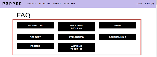
Image via Pepper
9. Leverage Chatbots
Chatbots can be a great asset to elevate your overall customer experience. Through them, you can answer customer queries, provide product suggestions, or even connect customers to customer service representatives.
You can also deploy chatbots on other social media platforms to broaden your reach. For instance, lingerie brand, Aerie, has a chatbot on Kik. The chatbot asks a series of questions to their customers to gauge their preferences.

Image via A Better Lemonade Stand
Ready to Create a Customer-Centric Ecommerce Website?
It’s true — the customer is always right.
And while you are designing your ecommerce website, you need to think about the features that they will like.
Your ultimate goal should be to provide them with a smooth shopping experience. Use the tips mentioned above to improve your ecommerce website and elevate your customer experience.
Do you have any questions about creating a customer-centric ecommerce website? Please share your thoughts in the comments section.
——————————————————————————————————————————-
Author Bio:
Shane Barker is a digital marketing consultant who specializes in influencer marketing, content marketing, and SEO. He is the co-founder of Attrock, a digital marketing agency. He has consulted with Fortune 500 companies, influencers with digital products, and a number of A-List celebrities.
Social connects: Twitter, LinkedIn & Instagram
Tagged with: droppshipping • eCommerce • make money online


